Onza
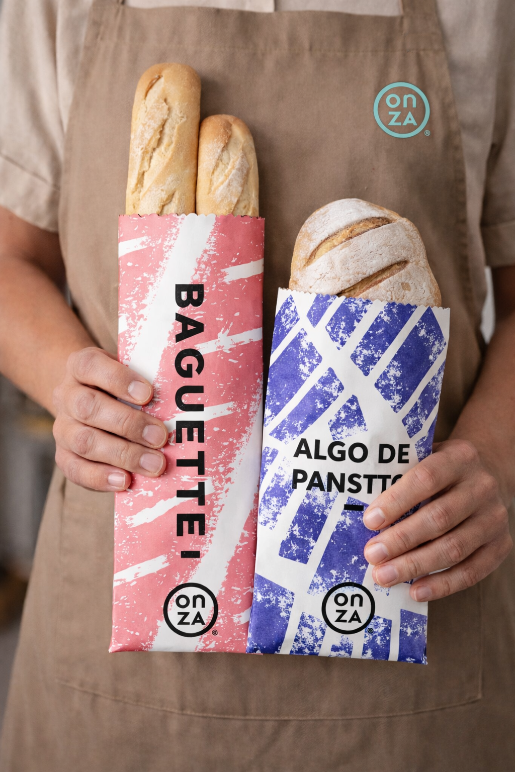
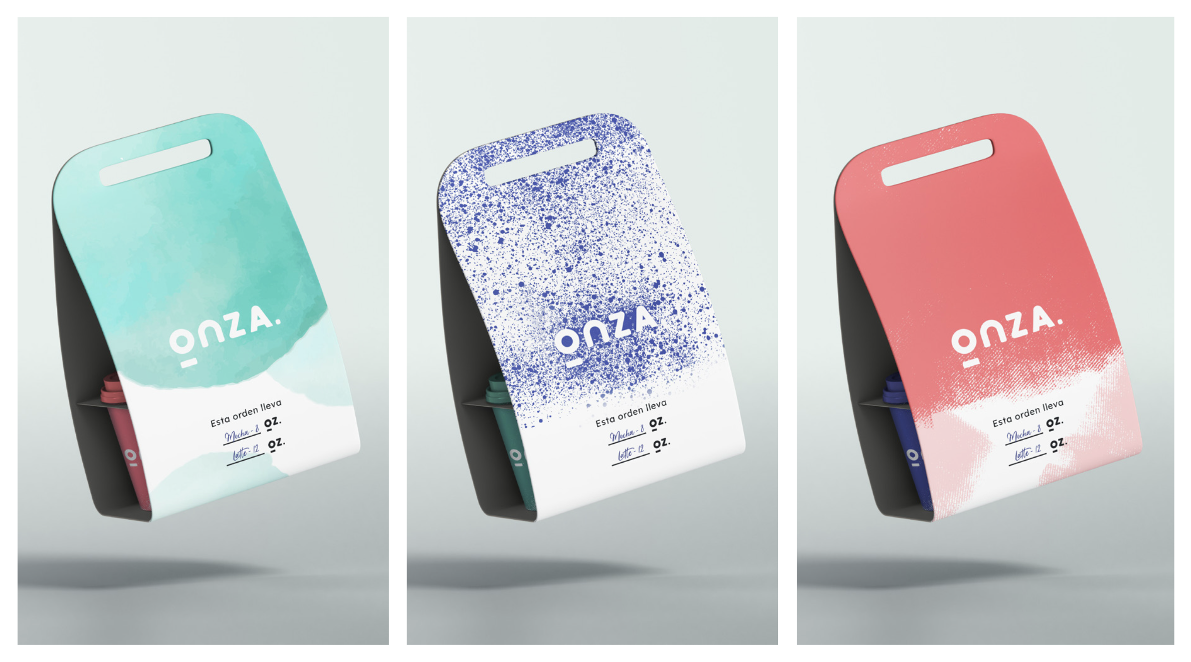
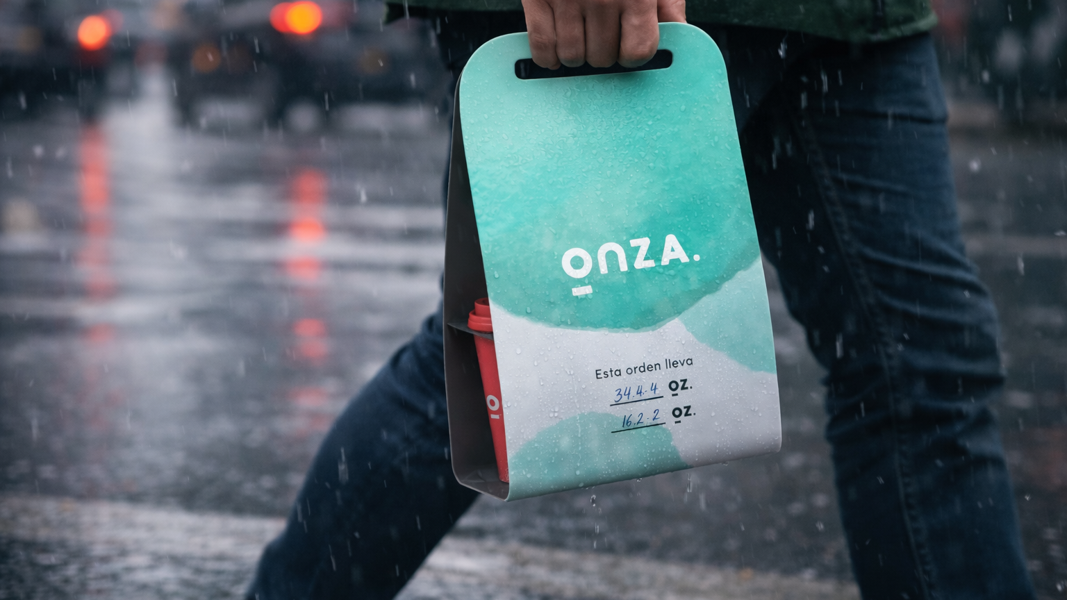
A branding project for a café-restaurant in Bogotá D.C, which needed to evoke a fresh and modern, yet uncomplicated and approachable look-and-feel. With the latter in mind, a system of color, illustration and texture was created to dress up all the brand collateral.
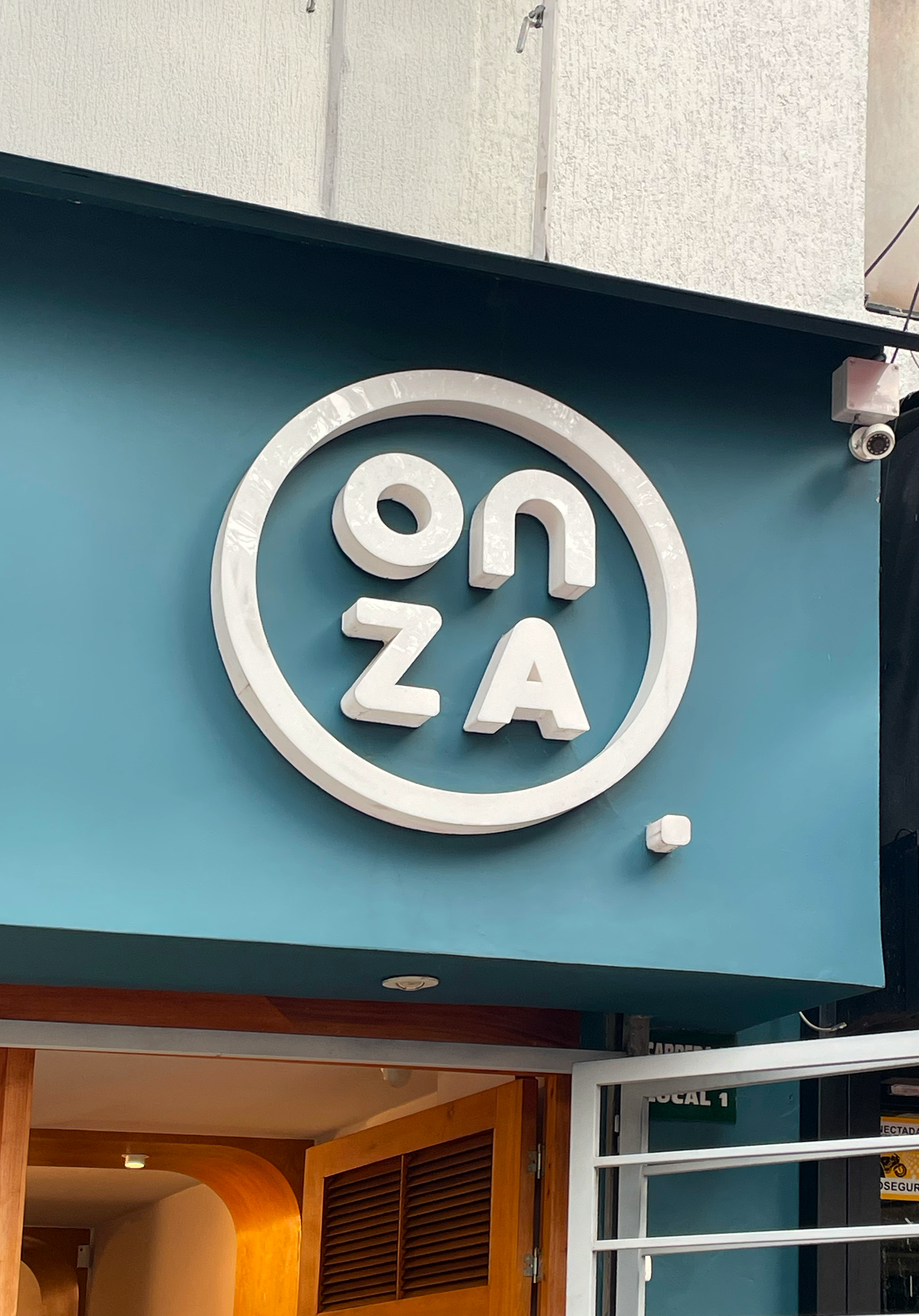
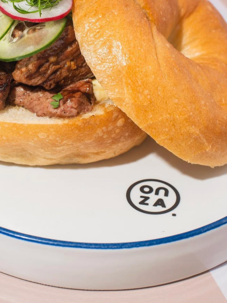
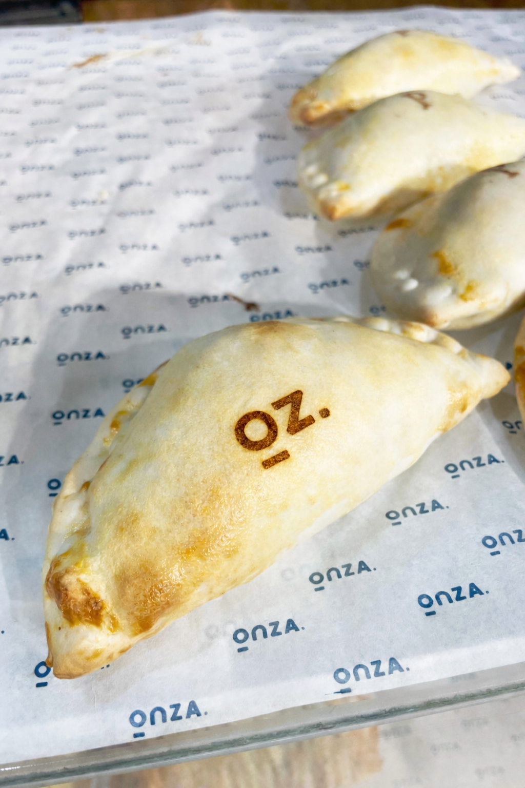
The ‘o’ in the main logo represents the ‘ounce’ (Onza) unit of measure, place over a surface that’s weighting it. This concept is represented in two of the logo variations, plus a stamp-symbol that can be used across all circular elements found in a typical café environment (dishes, mugs, bottles, coasters, etc)
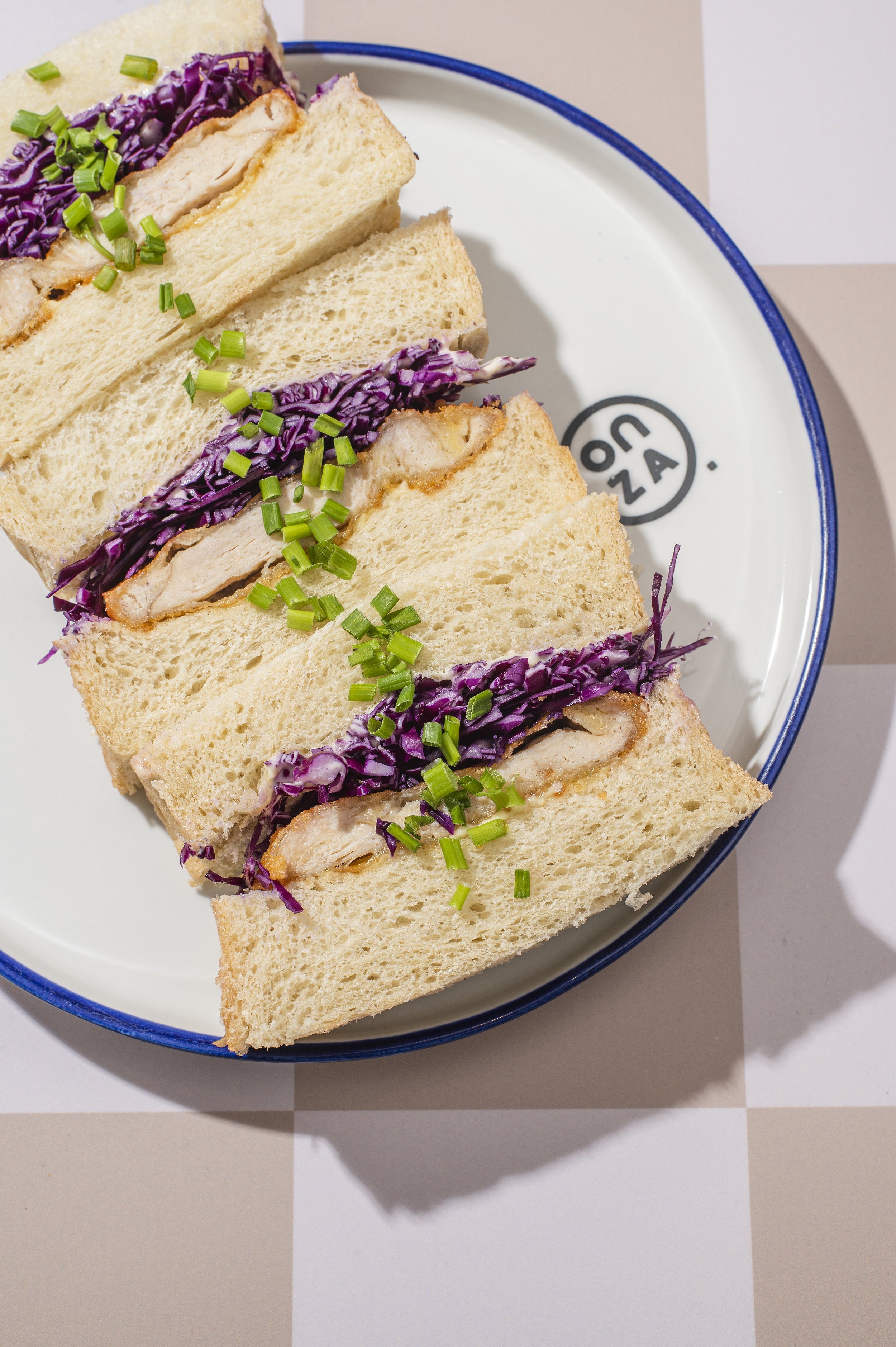


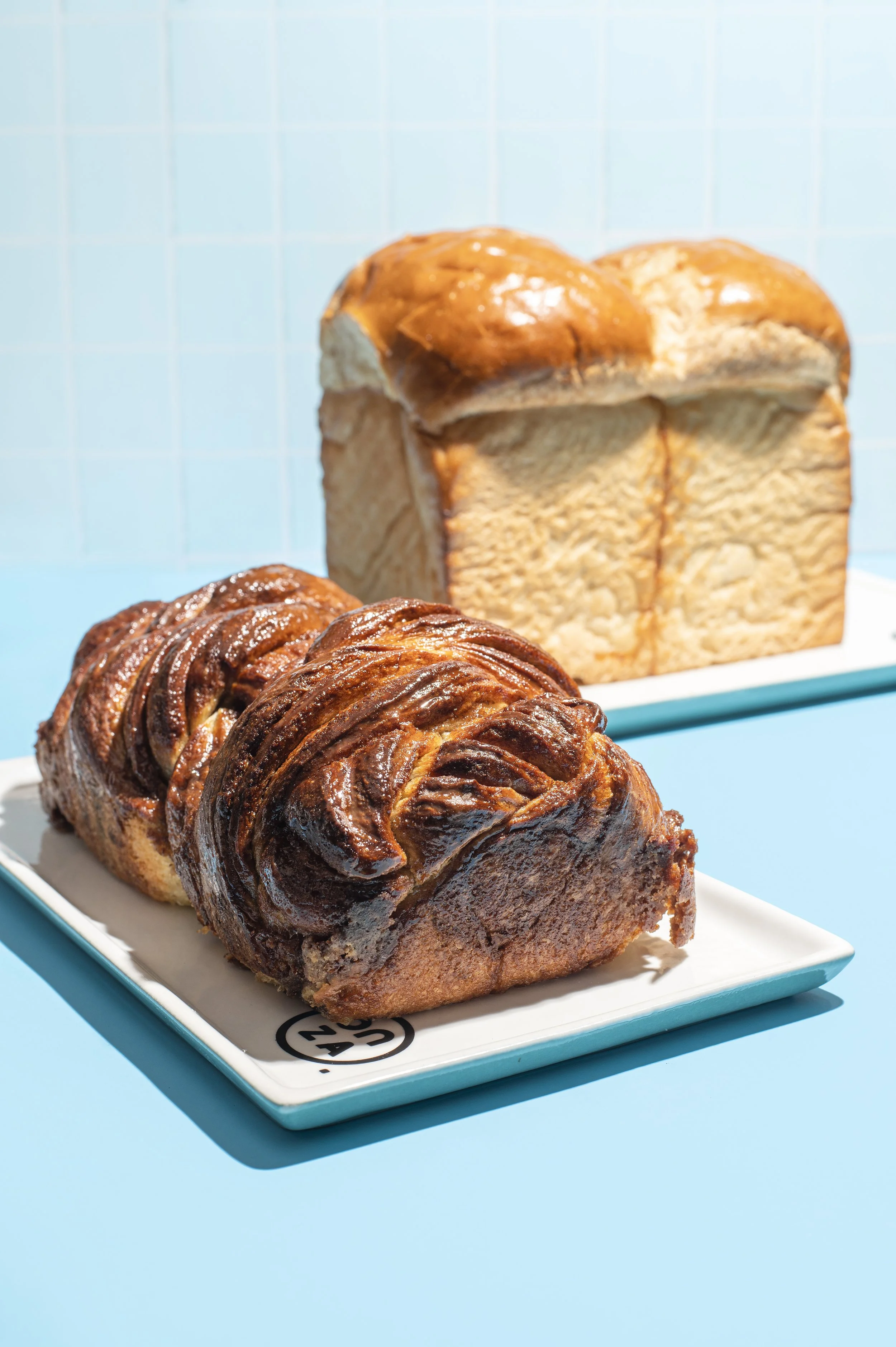
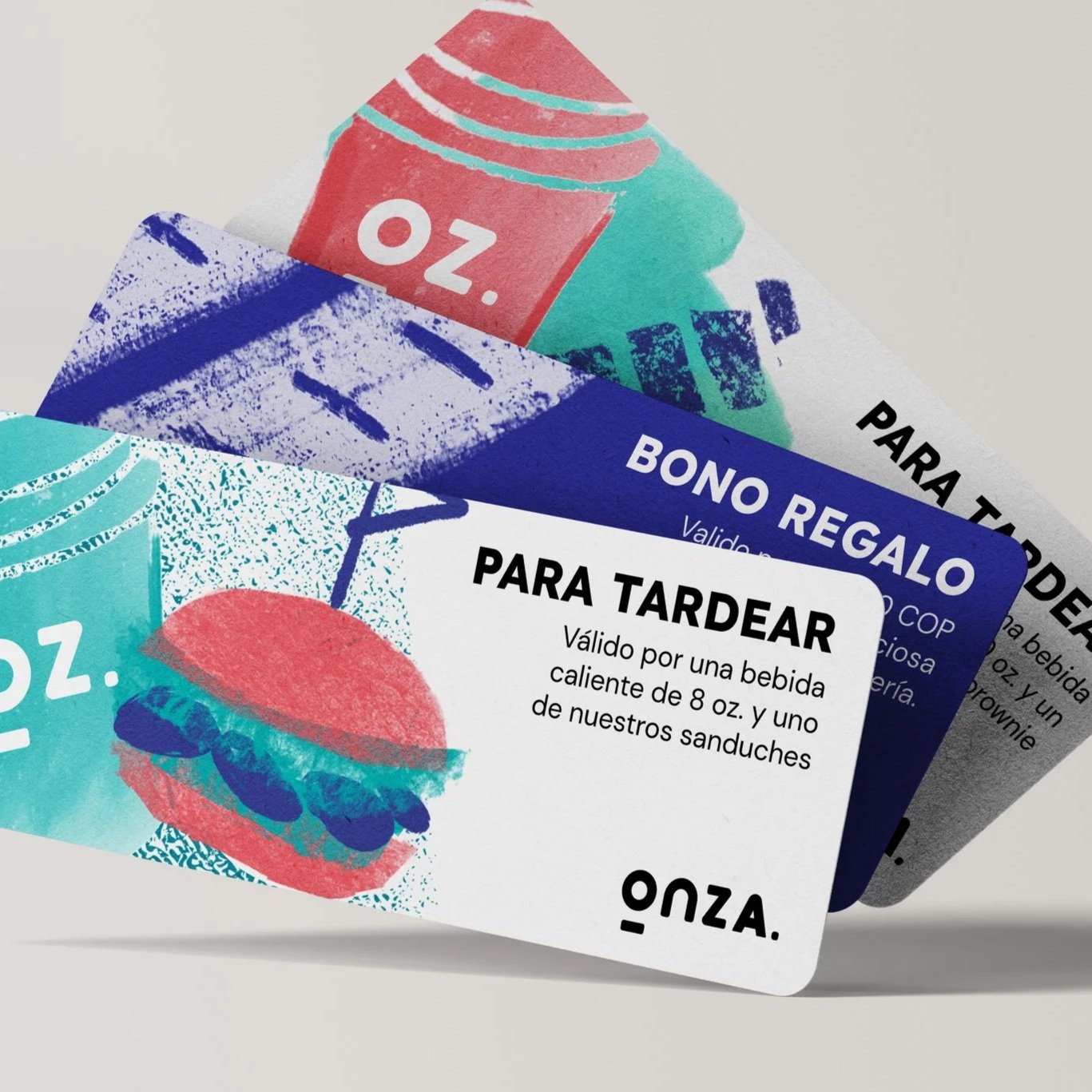
Onza’s graphic identity included a selection of different organic looking textures, and illustration, that represents balance between the minimalism in its logo, and the complexity and rich flavor in its products